I guess I shouldn’t be complaining… And I really wouldn’t call it a complaint, its more like a frustration that I feel apt to voice.
My work for the Public Relations office and student publications sends me to almost everything you could possibly imagine that deals with the University. Well, I’ve been doing more and more feature portraits these days… like, a lot. And some of them (that I have to hold back on just yet) have gotten pretty elaborate. Many with as many speedlights as I can get my hands on (usually about 3 or 4) and lighting schemes that have made it into my portfolio.
But, some of them are the simplest of photos. One light. Maybe a second kicker. Nothing fancy, but things with which I’m quite pleased…
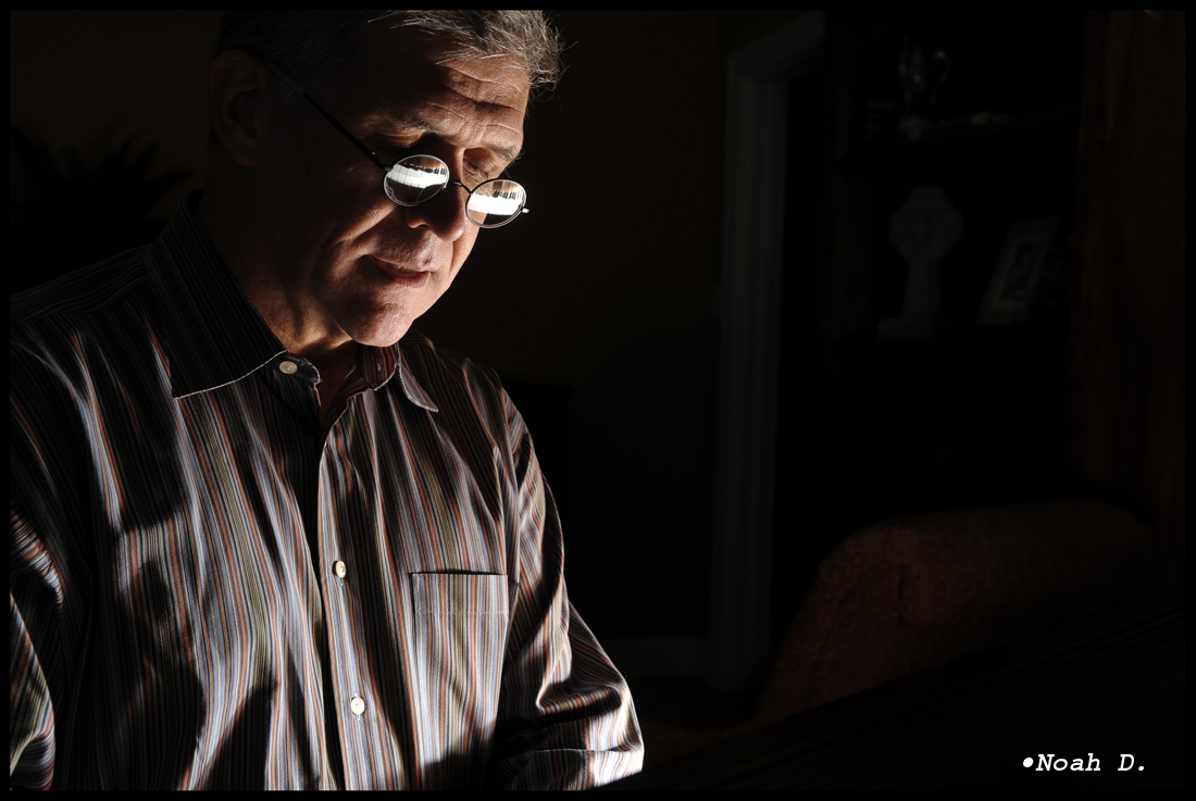
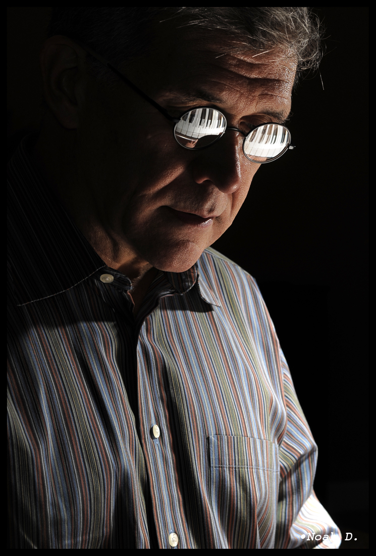
Dr. Hopper is the dean of my University’s international programs, but he’s an extraordinary pianist. Extraordinary. I just wanted a little portrait at the piano… a little portrait with a little extra flavor.
So there it is. Extremely simple. Problem is, I can’t decide between two shots. Wanna weigh in?
That 17-55/2.8 is just stupidly sharp, don’t you think?
So that’s one light. Just one. And, by the way, all the lights in the room were on. There were a bunch of people around and I couldn’t just turn everything off. So, hover your mouse over the photo to see how I did it.
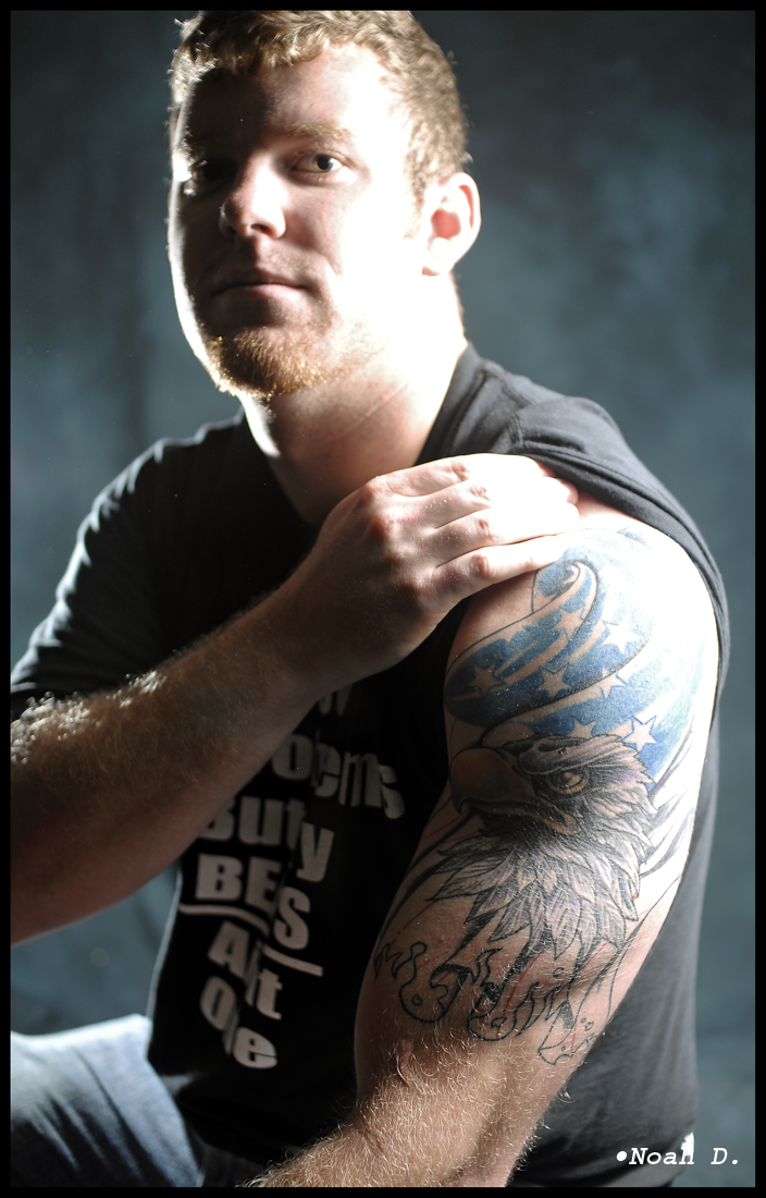
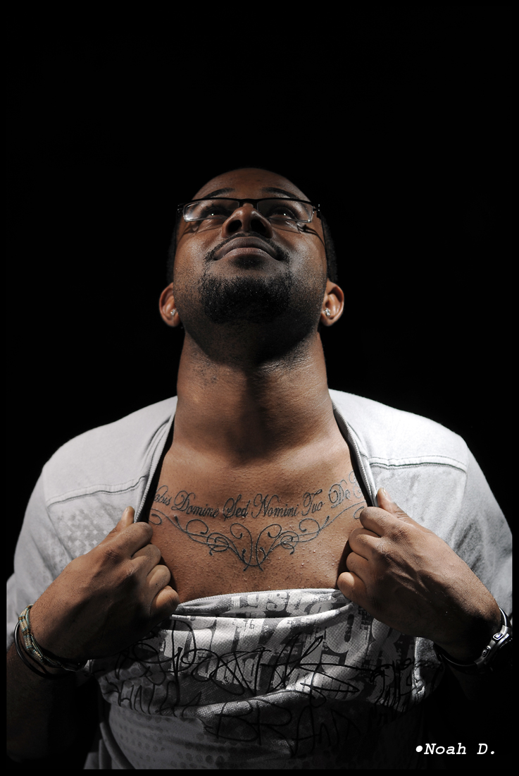
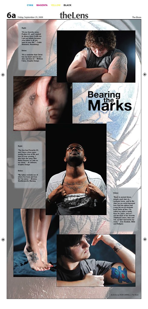
Next, two lights. And pretty simple, honestly. These were done for an article in the paper on student tattoo culture. It was a whole paper gallery – full page.
Pretty radical lighting on one, but it was done on purpose. Its supposed to be edgy. Its supposed to be blown out. The non-blown out version just wasn’t… something.
The other is much softer.
These two were under studio conditions – backdrop and all. Granted, the same blue muslin backdrop… light intensity and other factors cause the blackout on #2 there.
The whole collection together on the page turned out like this:
So that’s two lights… but it didn’t stop there.
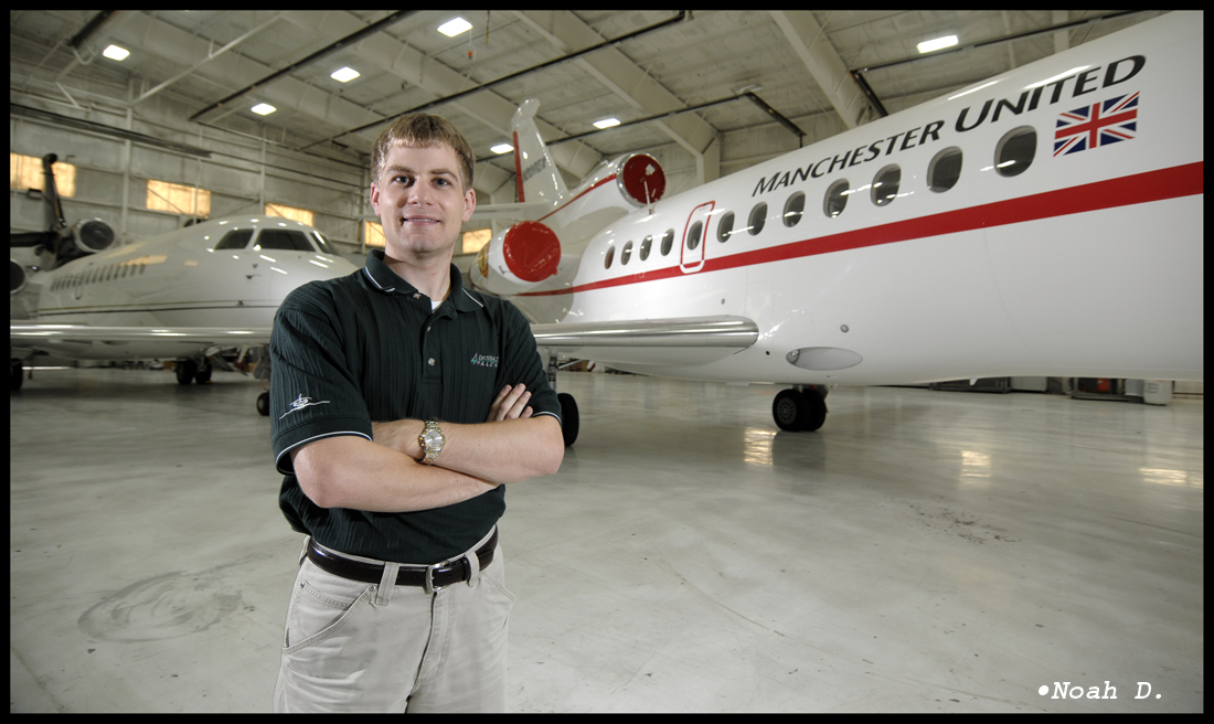
How about something bigger with three lights?
As a photographer, I get some pretty ridiculous access to pretty ridiculous places… but into the Central Flying Services hangars at the Little Rock airport where there are two newly-painted FalconJet aircraft to take a few “executive” portraits of an engineering student from my university that worked there this summer? Sure! Why not!? Come on in! And why don’t you go on a quick tour of the factory, while you’re at it!?
So you can probably see the light arrangement rather quickly – its not complicated – but it was huge. Shocking, in fact, that the little CLS sensors picked up 50 feet away!
The alternative pose? I prefer it, actually:
Yeah, it doesn’t show the coolness of Manchester United and Caesar’s Palace planes in a hangar in Little Rock, but it definitely stands out. It pops. It makes the intern look quite… executive.
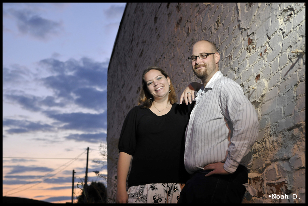
Alas, no 4-light setups yet. Yet.
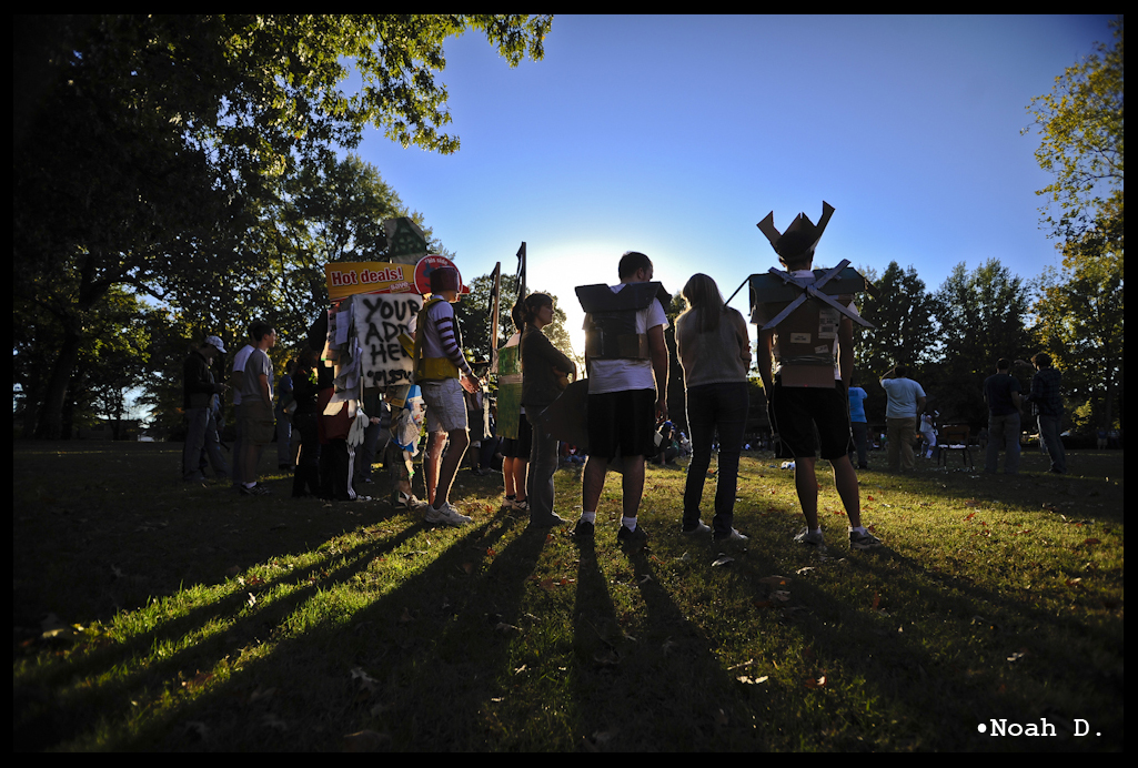
So, its that and more football. Volleyball is starting up, which will be fun. But this week promises to be a little less messy than last week. But surely, it can’t be any more cool. Anyone have any idea what to do with a French English major? Yeah, me neither.
We’ll just see… Stay tuned,
-Noah D.
